Brand
The logo, the colours
and how to write esfis.
If you need to talk about esfis in an article, a deck or an integration, take the files from here instead of grabbing a screenshot.
Logo
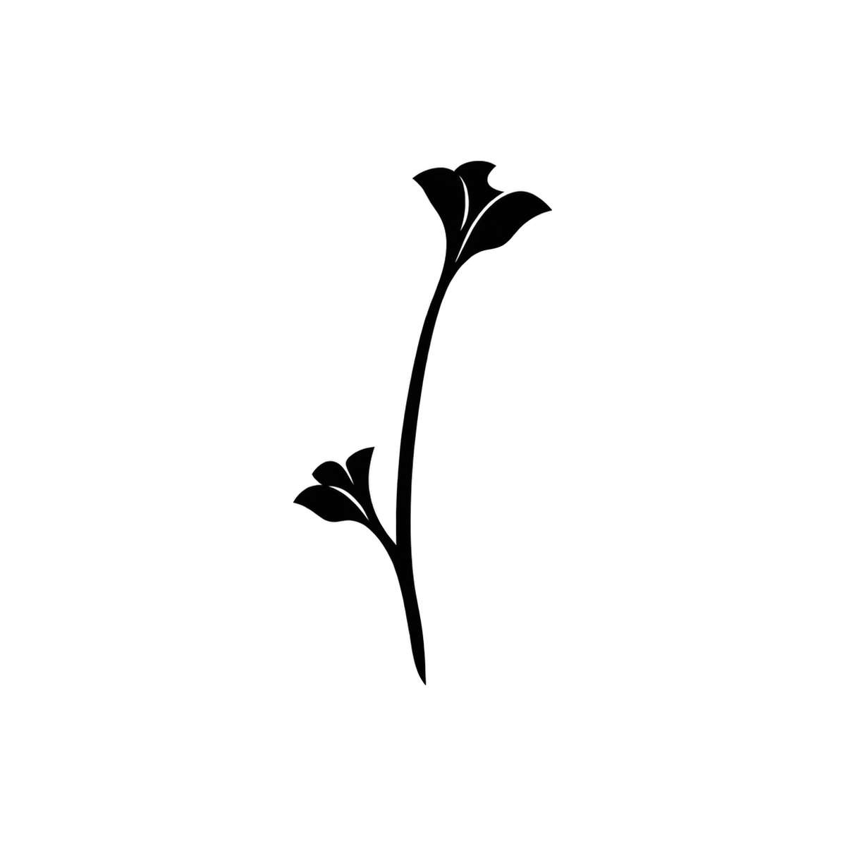
The symbol is two small seed pods on a single stalk. The full logo is the symbol with the name to its right, always in lower case.

 esfis
esfis
esfis
esfis




How to use it
Do
- Use the black symbol on light backgrounds and the white one on dark backgrounds.
- Leave clear space around it of at least the width of the symbol.
- Minimum symbol size: 16 px tall.
- Always scale it proportionally.
Don't
- Don't recolour it, or add gradients, shadows or outlines.
- Don't stretch, skew or rotate it.
- Don't place it over an image without enough contrast.
- Don't change the typeface of the name or the spacing of the logo.
How it is written
esfis, always in lower case, including at the start of a sentence and in headings. Not Esfis, not ESFIS, not esFis.
It is pronounced ess-feess. If a sentence reads badly starting in lower case, it is better to turn it around: “The esfis app…” rather than “Esfis is…”.
A short description, in case you need one:
esfis is a macOS app that turns your folders into projects, opens the AI agents you already use inside them and keeps one shared context across all of them.
Colours
Clay is the only brand colour: it marks what is interactive and nothing else. The rest is paper and ink.
- Clay
#a54a34accent, light background - Light clay
#e88a6caccent, dark background - Ink
#111110text, light background - Paper
#fffffflight background - Night
#0c0c0bdark background - Light ink
#f4f4f2text, dark background
Typography
Two families, both free.
Anything else
If you need a format that is not here, a screenshot of the app or an interview, write to esfis@f.cat.